With decades of experience and accreditations in software application, data migration/ integration, and IT consulting, Business Cents helps you identify best practices combined with product solutions practical for your business model. As Intuit Premier Resellers, Quickbooks Advanced Advisors (Desktop and Online), and Certified Lightspeed Experts, Business Cents stays current with new trends and guides clients toward innovative programs that support streamlined workflow and financial success.
https://bcents.com/
The kind folks at Business Cents asked me to develop the new brand logo for Business Cents, to be used on all digital and print collateral.
I worked closely with my contact at Business Cents, as we explored extensive Q&A and analysis in regards to the client, competitors, industry and their audience. Starting off, I worked out some sketches, breaking down the fundamentals of letter and symbol structure. From the sketches, I was able to come up with 3 distinct styles and develop 2 logo concepts within each style.
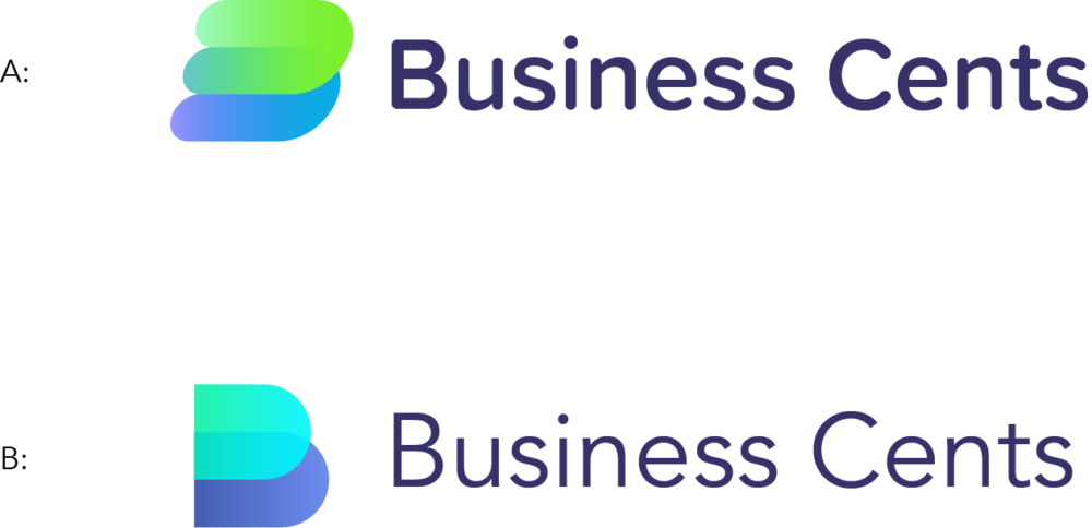
Direction 1: Established Fintech
- Feel of a well established brand
- Simple and rememberable using an abstraction of the capital “B” as a logo mark
- Colors provide a sense of cleanliness and simplicity
FONT:
A. visually relaxing the eyes with Proxima Soft typeface
B. establishing a level of financial good taste with the Avenir typeface(sourced from current website)
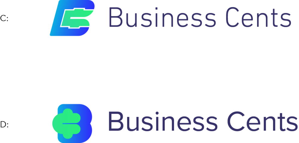
Direction 2: Crypto Currency
- Utilizes both the B and the C of the brand name
- Incorporates the cents symbol
- A friendly crypto currency feel
FONT:
C. balanced by the fixed width, technical typeface, Din Next LT Pro
D. accompanied by the always simple and elegant Proxima Nova
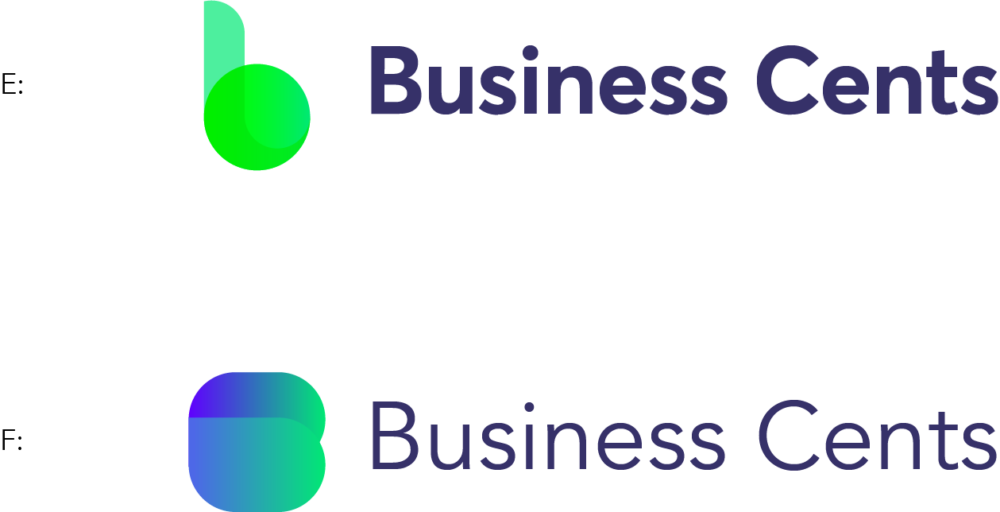
Direction 3: Startup
- Simple abstract shapes representing the initial “b” in both lower and upper case in the two versions
- Clean, elegant, and memorable
- Youthful and friendly
FONT:
E. contrasted by the bold symmetrical Averta typeface
F. accompanied by the light, clear and symmetrical typeface, Avenir
After a few rounds of refinement and collaboration with the client, we were able to come up with variations using the typeface weight and size and placement, color and dimension of the logo glyph.
Here is the final version that is currently being used on their site.
I am looking forward to seeing more collateral with the new brand implemented into it.