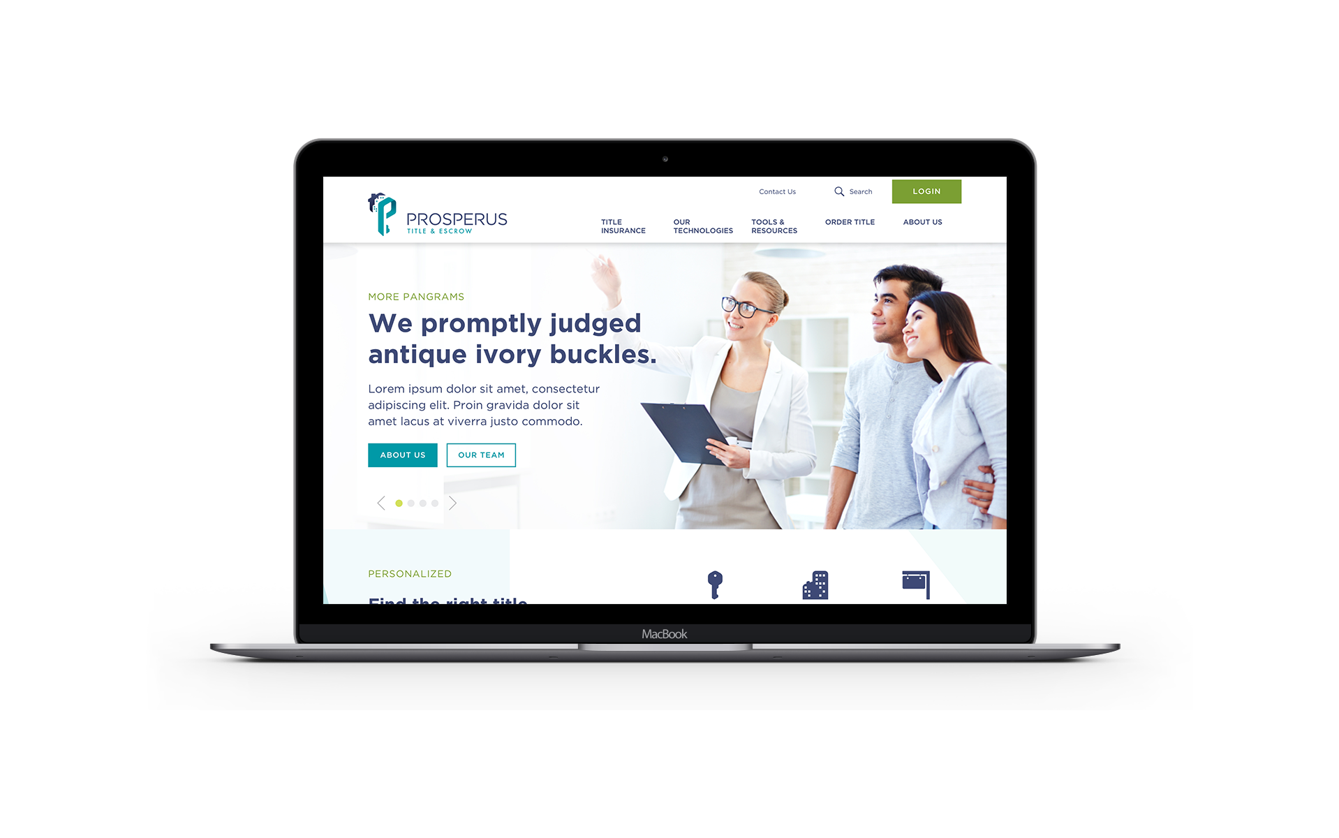
Returning client, Greater El Paso Credit Union (GECU), launched a subsidiary called Prosperus, billing themselves as the ‘newest’ service in Title & Escrow. We were tasked with designing their debut marketing website for their rollout this year. At the project’s inception, my initial task was to complete a competitive analysis of the other title & escrow companies already in existence in their area. From there, I worked closely with the UX team to establish a strategy in order to build their online brand and presence.
Once we had the client on board with our potential strategies, we conducted user research studies to dig into and further define the experience they were hoping to deliver. We wanted to give the client a CMS system that would be easily handed off and managed on their end, while still maintaining a customized feel for the Prosperus team. Working with the lead UX designer, we established that we would need to create about 25 different modules that could be easily customized and robust enough to handle the varying types of content needed for this site.


Part of establishing the online look and feel of the new marketing site, was setting the tone and providing guidance in the direction of photo use. Here you will see the two styles that they picked and wanted to merge, using the wide and light tone, but bringing in the up-close and personal style.
If there was to be a theme for this Prosperus project, it was efficiency. Once the home page UX was half established, we decided to skip mood boards, instead moving into design directions early in order to both establish the look and feel and to tap into existing wire frames to convey the design in a more realistic approach. By designing these wire frames congruently with our design directions being created and revised, we were set up incredibly well once the final revisions were in place, and once we re-presented we got client approval almost instantly. After just two rounds of revisions, we got final approval to begin the back end, and the rest is history.
Prosperus built their logo off of icon elements, and I saw this as an opportunity to reverse engineer their logo, and build out the start of their online marketing icon library.
My main contribution to the efficacy of this project was the fact that I was present and included in every step, from the kickoff to approval. I was able to develop a deep understanding of the product as well as develop a rapport with the client and team, who took my feedback and direction into account. It must be mentioned that the Prosperus team is wonderfully susceptible to design direction, and that they trust that the experts they’ve hired will do their job well.


To see the well oiled machine this project became is to also accept that in the beginning, we felt time was being squeezed dry due to holidays and unforeseen life events. I expressed that I wasn’t feeling confident in my designs, as we were working on unrealistic deadlines, and because of this, I was given three extra days to perfect them. With this extra space, I was able to create a handful of designs I was deeply confident in, and the client responded in kind, trusting our guidance through process more than they may have if we had initially presented designs we ourselves doubted already.
