Picnik! is an alternative solution to lunch on the go. The concept is to have take-away fresh sandwiches, coffee, salad, etc, prepared fresh on a daily basis at a reasonable price. The foods which are sold at picnik! are considered brain fuel—healthy choices on the go to help concentration and thinking while providing healthy energy. Simple choices for students and workers who have a lot to do and want to make healthy choices.
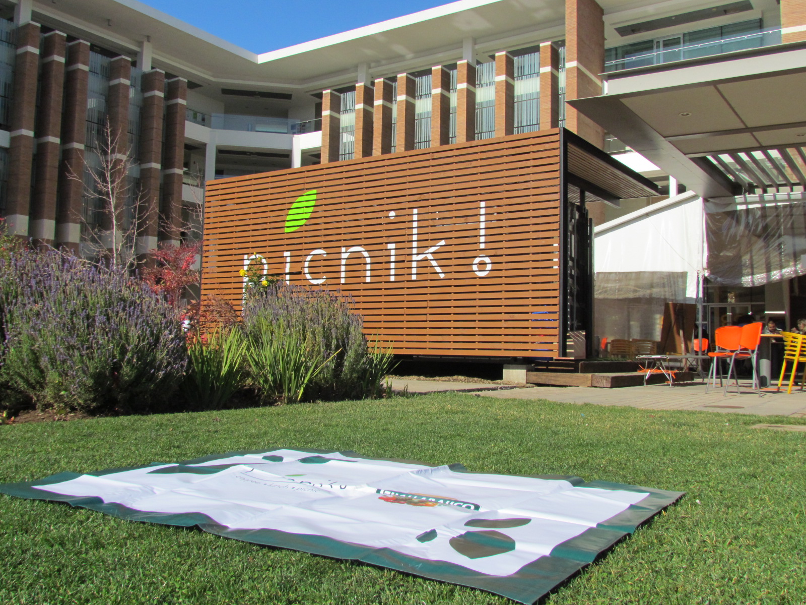
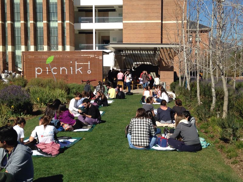
I met founder, Guillermo Ariztia, while traveling and working abroad and he presented to me his idea of this food start. After brainstorming some ideas for a name, we both agreed that picnik! was a suitable name for what he was going for. He conceptualized the idea of trading in your identification for a rental blanket, so that after you make your purchase, you can take the blanket and set up, a picnic. We soon went to work conceptualizing the brand.
The idea of picnicking and fresh biological greenery was a strong starting point.
Picnic blankets? no.
Blades of grass? no.
Ants carrying away a wicker basket? no way.
The concept to me, felt, light and airy. Outdoors, but not rugged. Stable, but not aggressive.
The blue sky you see in the Microsoft screensaver.
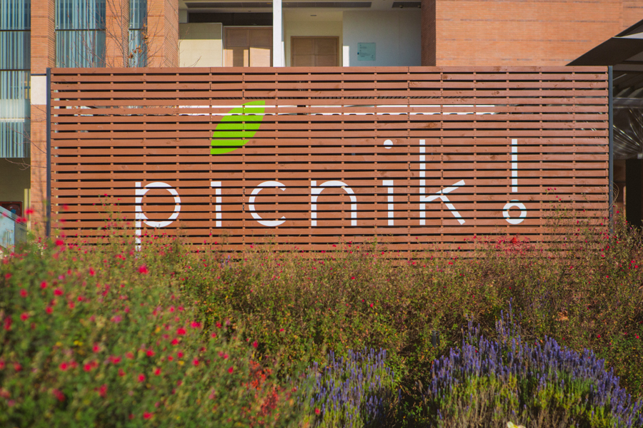
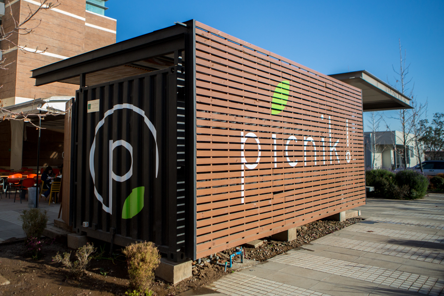
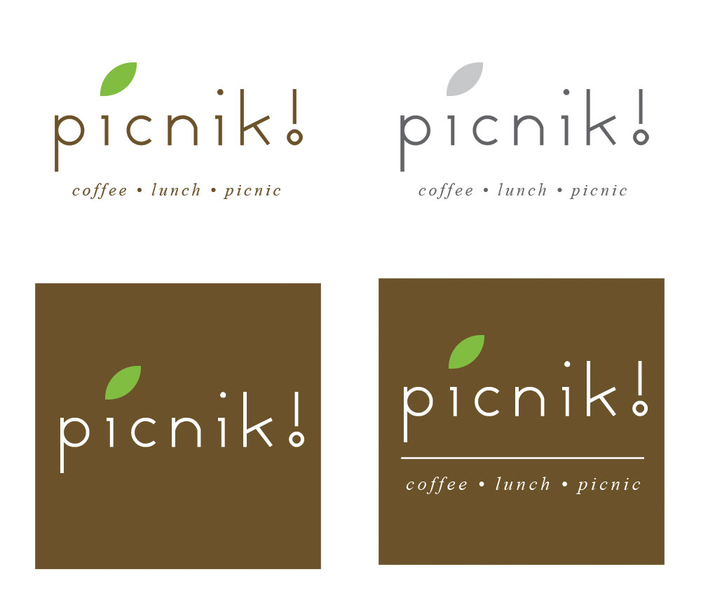
The logo was constructed using a simple and light sans serif font, all six letters, lower case. The ascenders and descenders of the letters where raised on both the lowercase “p” and “k” to provide a lighter, taller mark, while still providing balance on both ends. An emphasis was given to the “i”, replacing the tittle with a green leaf, representing the freshness and bio feel that picnik is trying to convey for their products and added an exclamation point to the end to add excitement, because, eating is exciting!
Once we established the logo lockup we made sure it worked in different sizes as well as a desaturated version. With my background in silk screening graphics, I used solid colors and limited it to only two basic swatches to ensure minimum costs for production for specialty printing and printing press reproduction. Other brand system elements would later reveal themselves as I deconstructed the logo to establish the brand pattern which was applied to the business cards and product labels.
The website proved to be a bigger challenge. More informational than experiential for the time being. Also, with a budget of “zero”. We discussed options, and we felt it was best to start with a temporary site that we can grow as needed. A responsive out of the box, free, wordpress theme was the best starting point that he and his team can easily manage and update that would respond to all device sizes.
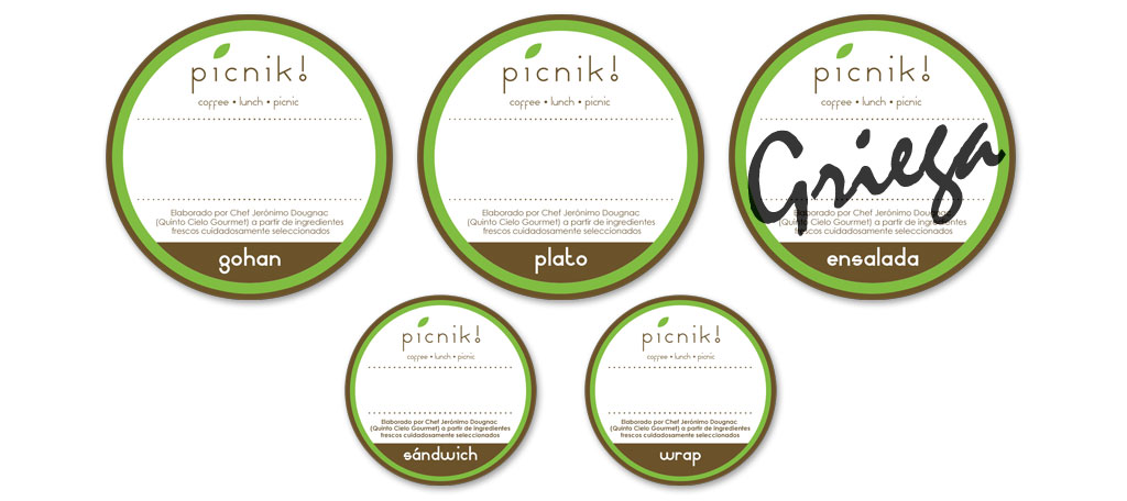
The site and identity had been established and we moved forward with designing the labeling for the products. Two different variations, one at 6 cm and one at 4 cm were created as starting templates, both designed to have a hand written marker of what type of product it was (pollo, vegetarian, carne, etc.), and the only element that varies between the labels is the 5 different classifications (ensalada, sandwich, gohan, wrap, plato), in order to keep the production costs down.
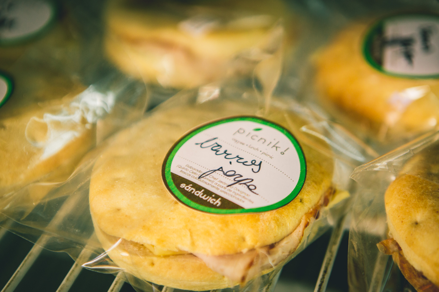
In the summer of 2015, I had an opportunity to visit Guillermo in Santiago and made a stop at the fist of the picnic stores on the university campus. It was surreal to see the end product of all the hard work we had done together, in-person as a physical, real-life structure, in a foreign country. There are now 5 different picnik! locations around the greater metropolitan Santiago area.
